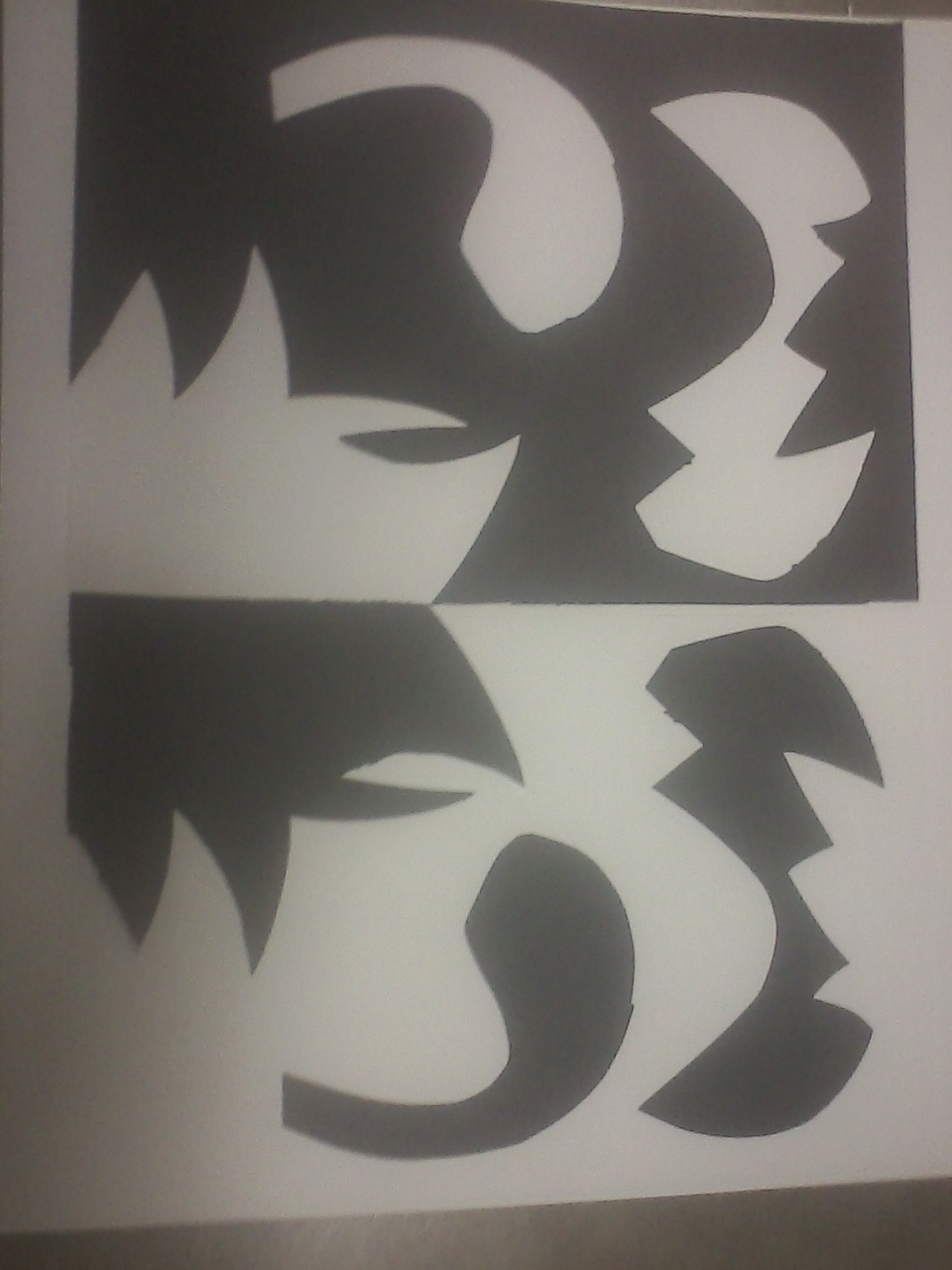
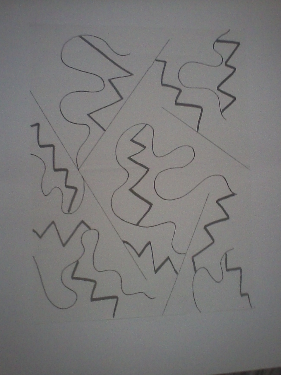
Project 8: Organize the random

securedownload-1

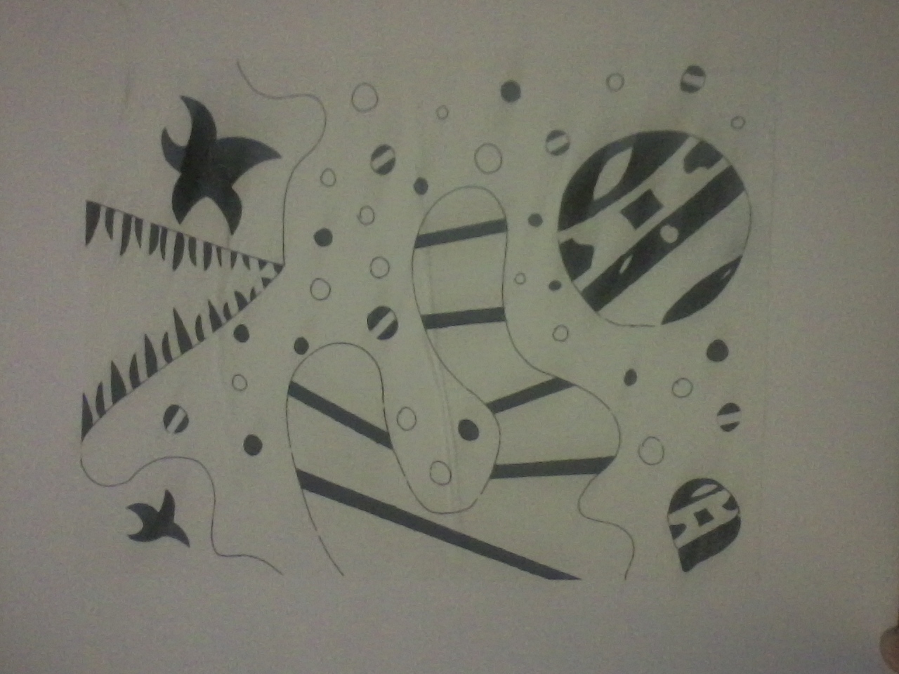
Project eight I had to incorporate white out tape in my piece and be able to unify that with biomorphic shapes. I was a little lost on this project and couldn’t really come up with a good idea of how to fully intertwine the elements given to me, but I like what I came up with because I mostly like to do things that are cool looking and spaced out.

Color Wheel: Project 10

securedownload

Project ten is involving paint hues, primary colors,  and the mixings of tint and shade. In my color wheel, my paint is evenly constructed. I showed percise color hues in my color wheel up in-till you get to the blues, as you can see I did forget to add one blue hue. I was more focused on mixing my purples correctly I didn’t noticed there was one to many. In the five tints I started off good but I didn’t get the gray that we was suppose to get in the middle. For my eight shades I could have made it a lot neater as for the hole thing but over all I believe I accomplished this project.

Project #6: Tactile and Visual Texture

securedownload

In this project we was suppose to Show visual texture which is to make it look like you can guess how it feels, we also had to show that one texture was on top of another. I was going to use wood, tiles, rope, and swad. I had to many ideas for this project thats why its so small, I should have made it bigger and more visible. I also have a hard time with the pens. But really I should have just finished it and showed more visual texture.

Project #5: Black and white composition.

securedownload


In this black and white composition I perfectly showed symmetrical views. I honestly think this was the easiest project yet. I know I could have did a lot more if I had the time, but I still like the design I came up with. I didn’t know that I was suppose to have white on back paper and black on white paper however It still looks like that I did so its hard to tell I did. My composition makes my piece look hold and together and perfectly mirrored which was the goal of the project.

Project #4: Directional Dominance.

securedownload-1


My art here is a directional dominance piece and I show that by crossing my lines to show a darker diamond in different areas. When you look at it you can see that it is mostly symmetrical and alined precisely with the other side. I feel that the darker areas would have showed better if I had completed it with pen, then you could fully see the contrast between shading. I like the design mostly because its a great pattern that I love to use.

Project #3: Variation of lines

securedownload-2


In my art piece I showed 3 different line variations that describes myself. The thin straight lines describes the way I dress and talk to new people, The wavy thicker line represents my silly out going side, and the bold jagged line matches my crazy out going self. I tried to show that all the lines was connected and unified to show 3 personalities in one. I had used mostly repetition in my piece, I do believe I could have done more but over all its clean and nice.


1st project: Dynamic Composition

securedownload

In the first project I had utilized the whole picture plane, and I also show repetition through out my lines. I could have made more bold lines and make some of my lines more smooth because they look a bit wavy. I believe I did capture the goal of the project but there is always room for improvement. As you can see its hard to see the vocal point which is the little line dots, so next time I will make the vocal point much bolder or at least more visible to the eye. I do believe I could have through in more shapes and variation in my piece.